
Design Your Menu Without a Designer: Inside the Template Builder
By menu-MENA Team
Published on August 29, 2026
Two ways to build: sections or blocks
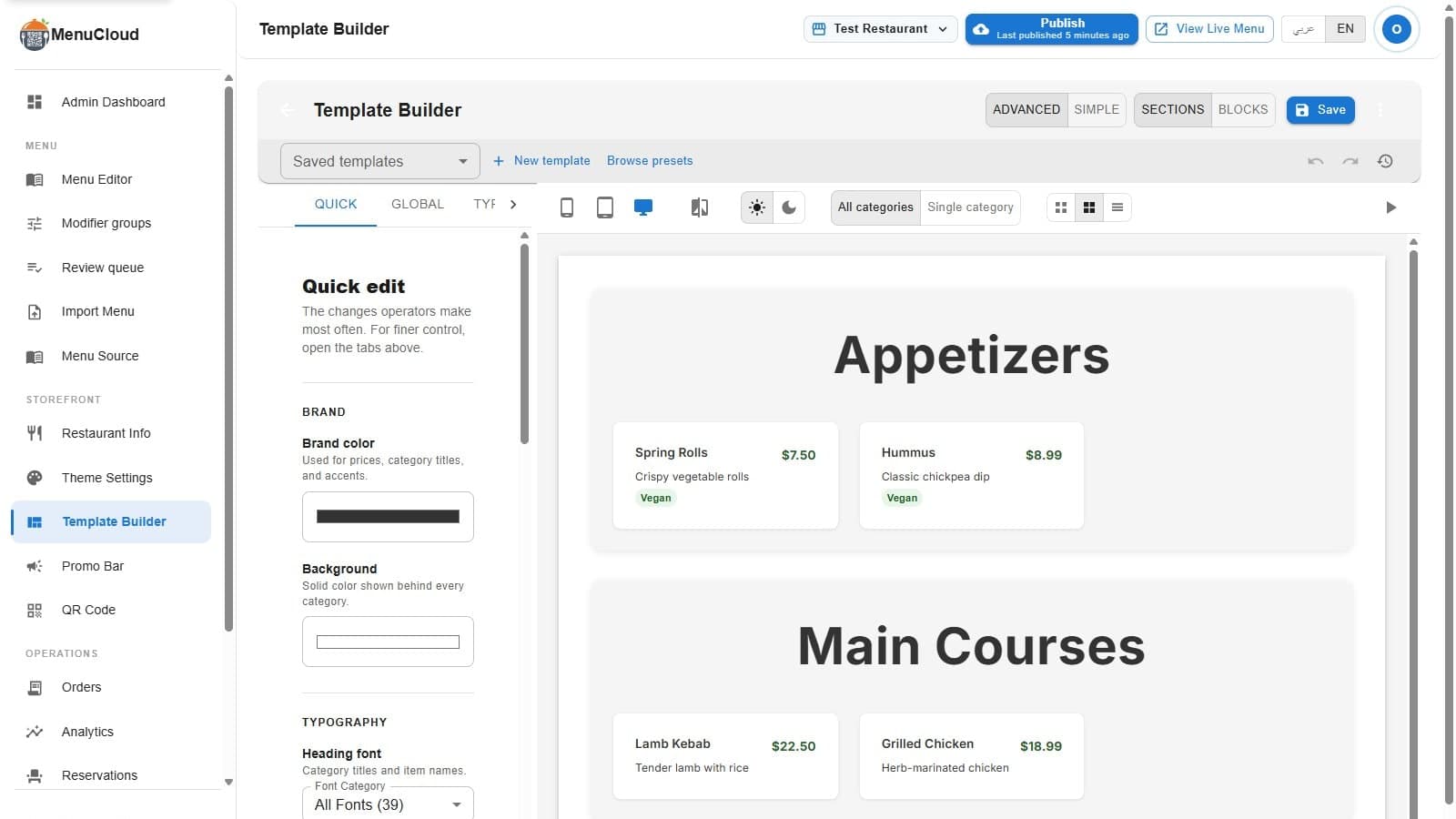
Open the Template Builder from Theme Settings and a toggle in the top bar switches between two editing models. Sections is the original approach: five tabs, Global, Typography, Category, Items, plus a Quick edit tab and a Visibility tab, each one styling a property across your entire menu at once. Blocks is a canvas: you place individual pieces, a Header, a Category Strip, an Item Grid, in whatever order you want, and each one only affects itself. If a template already has blocks saved on it, the builder opens straight into Blocks mode. Otherwise it defaults to Sections.
Neither mode is the "advanced" one. Sections is faster for restyling everything at once, colors, fonts, card corners. Blocks is what you reach for when you want the page itself to look different, a promo banner between two categories, a hero image only on the homepage, a footer with your hours and social links.
Placing and rearranging blocks
The toolbox on the left lists seven block types: Header, Hero Image, Category Strip, Item Grid, Promo Banner, Spacer, Footer. Click one and it drops onto the bottom of the canvas immediately, no drag required to add it. Rearranging what's already there is where the dragging happens: hover a block and a small floating bar appears above it with a drag handle, the block's name, up and down arrows, a duplicate icon, and a delete icon. Grab the handle and drop it against another block, or just click the arrows if you'd rather not drag on a trackpad. An empty canvas shows a hint: "Most menus start with a Header, then a Category Grid."
Clicking a block opens its properties panel below the toolbox, an Item Grid block, for example, lets you scope it to one category and set how many columns show on mobile, tablet, and desktop separately.
Twelve presets, not a blank page
Before touching individual settings, Browse Presets opens a gallery of 12 full designs: Clean Slate for a neutral start, Amber & Oak for a dark steakhouse or grill look, Majlis for gold accents on cream with Arabic-forward typography, Velvet Noir for fine dining, Sakura for a minimal Japanese menu, Quick Menu for a dense four-column grid built for fast food and long menus, and a handful more. Each card in the gallery previews its actual background, heading font, and card shadow, plus tags for column count and whether it uses a gradient or animation. For a closer look at what each one actually suits, Menu Templates Compared walks through all 12 side by side.
One thing worth knowing before you pick one: applying a preset replaces your current draft outright and clears its saved ID. If you were editing a template you'd already saved and named, hitting Save afterward creates a new template entry rather than overwriting the one you started with.
Quick edit, or the full set of tabs
The Quick edit tab groups the changes most owners actually make onto one screen: brand color, background color, heading and body fonts pulled from Google Fonts, a card-style picker (image position, price placement, column count), spacing density as Tight, Balanced, or Roomy, reading direction, card shadow, and corner radius. For anything more specific, the Global, Typography, Category, and Item tabs expose the individual fields Quick edit is built on top of. Match your menu to your brand covers the color and font choices in more depth.
There's a third option too: switch to Simple mode and click directly on a category title, an item name, or a price in the live preview. A focused panel opens for just that element, size, weight, color, and, for headings, uppercase or capitalize.
Checking the preview before anyone sees it
The preview toolbar covers mobile (375px), tablet (834px), and desktop, a side-by-side compare view showing mobile and desktop at once, a light/dark toggle, a single-category-versus-all-categories switch, and the same compact/medium/list view toggle guests get on the live menu. If your account doesn't have real categories and items loaded yet, the preview automatically fills in with sample data and a banner tells you so, so the screen is never blank while you're deciding on a look.
Undo, redo, and snapshots
Ctrl+Z and Ctrl+Shift+Z step through the immediate edit history. For something further back, open Snapshots from the clock icon in the toolbar: name a version, and it's saved with a timestamp so you can restore it later, or delete it if you don't need it. Up to 10 snapshots are kept per template. One detail worth knowing: snapshots are stored in your browser, not on menu-MENA's servers, so they won't follow the template if you switch devices. Template version history covers how restoring one actually works.
Save writes a draft. Activate makes it live
Save is always available in the top bar. The first time you use it on a new template, it creates the template document; after that it updates the same one in place. What Save does not do is touch your public menu. A green Activate button appears next to it only after a successful save, and only clicking that pushes the template onto the tenant's actual live page. Everything up to that point, drafting, previewing, comparing devices, undoing mistakes, happens without guests seeing any of it.
When you do want to move a look somewhere else, Export in the overflow menu downloads the current template as a JSON file, and Import loads one back in, on this branch or another.