
Menu Templates Compared: Which Preset Fits Your Restaurant
By menu-MENA Team
Published on August 29, 2026
Twelve starting points, not a blank page
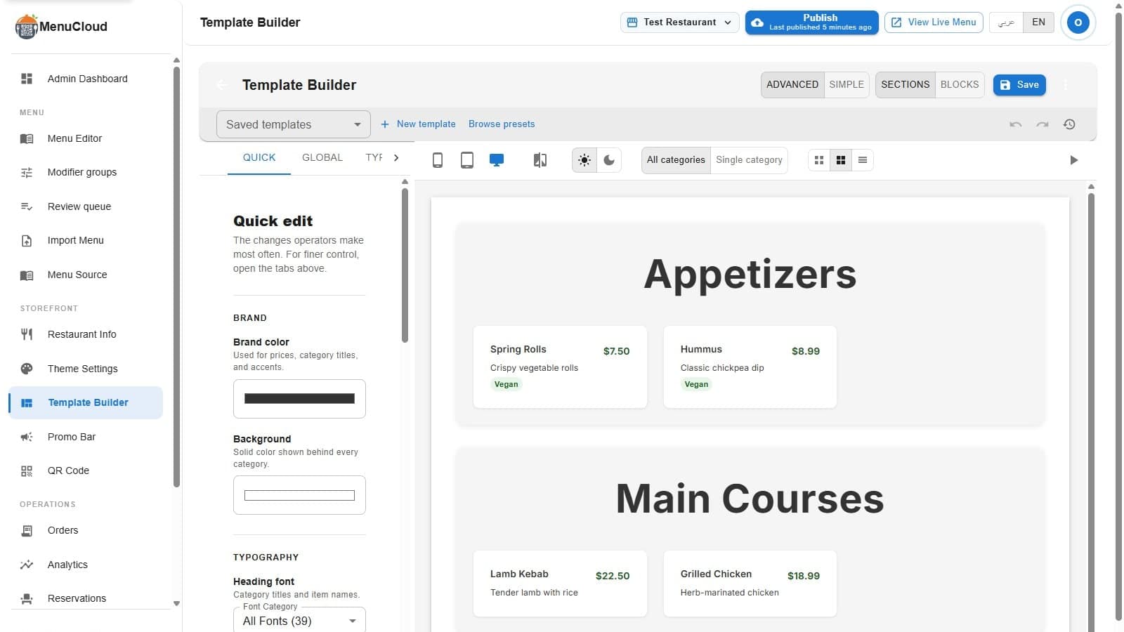
Open Template Builder and you'll see "Browse presets" sitting next to "New template" at the top of the panel. Click it and a dialog titled "Choose a Template Preset" opens with a grid of 12 cards. Each card renders a small live preview: a sample "Aa" set in the preset's actual heading font, weight, and color, plus chips showing the item layout (card, list, or compact), the desktop column count, a "Gradient" chip if the background uses one, and an "Animated" chip if hover and fade-in effects are on. Click a card and a checkmark badge appears on it; the "Use This Template" button stays disabled until you've picked one.
None of that is cosmetic filler. Every value a preset sets, background color, font family, heading size, category card padding, item image position, price badge style, animation on or off, lives in the same Global, Typography, Category, and Item tabs you'd edit by hand on a blank template. Picking a preset just fills those fields for you. Nothing locks after you select one; you can customize any field in the Template Builder afterward, and if you want to try a second preset without losing your edits, save a version first so you can get back to it later.
The twelve presets
- Clean Slate: white background, DM Sans, a 1/2/3-column grid with soft hover lift. Built to work for any menu, which is the point, it's the safest pick when you're not sure yet.
- Amber & Oak: near-black background, uppercase Cormorant Garamond headings in amber, single-column list with no item photos. Steakhouse, grill, bistro, menus people read rather than scan.
- Garden Fresh: white and mint, Nunito, 1/2/3-column grid, prices shown as solid green badges. Juice bar, salad counter, health-food cafe.
- Velvet Noir: pure black, Lora serif, rose-gold accents, a 280px hero photo on each category and a 110px thumbnail beside every item. Fine dining, lounge, cocktail bar.
- Sakura: off-white, Noto Serif with wide letter-spaced uppercase headings, a blush price accent, borderless minimal cards. Sushi, ramen, izakaya.
- Terracotta: warm cream, Libre Baskerville serif, rust-orange headings, prices rendered as a colored banner across the bottom of each card. Italian, Mediterranean, wine bar.
- Majlis: cream and gold, Cairo paired with an Amiri serif secondary face, gold price badges, and right-to-left direction set by default. It's the only preset built right-to-left out of the box, aimed at shawarma, grill, and Middle Eastern menus written primarily in Arabic.
- Neon Bites: near-black, Space Grotesk, neon yellow-green uppercase headings, item descriptions capped at one line so cards stay short, 3-column grid. Street food, food trucks, fast casual.
- Patisserie: blush and cream, Josefin Sans with a Cormorant Garamond secondary face, letter-spaced uppercase headings, up to 4 columns, centered content. Bakery, café, dessert case, brunch.
- Coastal Blue: pale blue-white, Work Sans paired with Playfair Display, ocean-blue accents, 240px category header photos. Seafood, beach bar, fish market.
- Quick Menu: grey background, Inter, compact item layout with photos off by default, up to 4 columns, fade-in animation disabled so a long menu renders instantly. Fast food, QSR, any menu with more items than photos.
- Aurora: the only gradient preset, a purple-to-blue linear gradient background with solid white cards floating on top, Outfit font, 3-column grid. Modern brand, lounge, specialty coffee.
Picking one when you're not sure
If nothing on the list jumps out, start with Clean Slate. It's the one preset whose own description says it works for any menu, and it doesn't fight you if your food photography is uneven or your category count is odd. Switch later. Nothing about picking a preset on day one commits you to it in month three, and version history keeps every saved state so a second look never means losing the first.
The real decision usually comes down to one question: does your menu lean on photos, or on words? Presets like Velvet Noir and Coastal Blue give categories a hero image and items a thumbnail. Amber & Oak and Quick Menu turn photos off by default and let typography and price do the work. Pick based on what you actually have, not what looks best in the preview card.