
Classic, Default, or Modern: Choosing Your Menu Layout
By menu-MENA Team
Published on August 29, 2026
Open your admin dashboard's Theme Settings page and you'll see three cards: Default, Classic, and Modern. Each one is a live thumbnail built from your actual menu, and picking a different one changes nothing about your data. Same categories, same items, same prices, same photos. What changes is how a guest reads all of it on their phone.
The three aren't just color variations on one template. They're separate components, and the differences hold up once you look at how each one actually renders a category.
Default: the layout every new account starts on
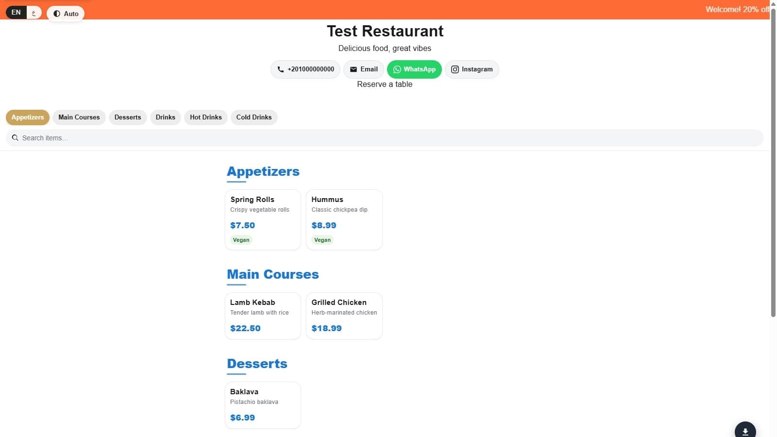
Default is what a fresh menu-MENA account opens on before anyone touches Theme Settings. It's a card grid: every item gets a box with its photo on top (when it has one), then name, description, and price stacked below. Category names get a short colored underline beneath them, drawn in your brand's primary color, which is the one visual signature that's unique to this layout. Cards lift slightly on hover. It's the widest of the three layouts, built to spread comfortably across a tablet or a larger phone screen.
In the dashboard, Default's own feature tags call out a two-column layout and hover effects, and that's an accurate description of what you're looking at: a menu built to be scanned visually, photo first.
Classic: built to read like a printed menu
Classic looks nothing like the other two by default. Instead of cards, items render as a plain list: name on the left, a dotted leader line, price on the right, the same layout you'd find on a paper menu at a sit-down restaurant. There's no image slot required, categories get a simple underline rule instead of a colored accent, and the whole thing sits in a narrower column than Default or Modern, closer to a single readable line of text than a spread of tiles.
That narrower, text-first design is exactly why Classic is the better pick for menus without much photography, or for sections like a drinks list or a shisha menu where a photo of every glass adds nothing. If you turn on the view-mode switcher (Theme Settings, under Public menu chrome), guests get three icon buttons to flip the density themselves. On Classic, that switch actually does something: choosing compact or medium collapses the dotted list into a grid of small cards, while list keeps the printed-menu look. On Default and Modern, that same switcher shows up but does nothing visible, since both stay locked to a grid no matter what a guest taps.
One honest gap worth knowing before you commit to Classic for an Arabic-heavy menu: its sold-out badge is a hardcoded "SOLD OUT" in Latin letters, in both the list and grid views. Default and Modern both swap that badge to "انتهى" automatically when the page is in Arabic. It's a small thing, but if your guests are reading almost entirely in Arabic, it's the one place Classic doesn't fully localize.
Modern: the same grid, with more room to breathe
Modern shares Default's basic idea (a card grid with photos) but nothing about it feels the same once you're looking at both side by side. Corners are rounder, cards get more internal padding, and category headings use a slightly tighter letter-spacing that reads more like a boutique menu than a listings page. There's no colored underline accent under category names here, which keeps the page quieter and puts the weight on the photography instead.
The hover behavior is the detail that shows the most care: Modern only lifts a card and adds a shadow on devices with a real pointer, using a hover: hover media check. On a phone, a tap doesn't leave a card stuck in its "hovered" state the way it can on some sites, because Modern never applies that state to touch input at all. It's a small fix for an annoyance most guests never consciously notice, but would definitely notice if it were missing.
Modern's own sold-out badge, like Default's, localizes to "انتهى" automatically, so that's not a factor when choosing between the two.
What stays identical no matter which you pick
Dietary and allergen tags, sold-out toggles, the search bar, category tabs, sub-category indentation, and the WhatsApp cart all work exactly the same across Default, Classic, and Modern, because they're built from the same shared pieces underneath the three layouts. Switching your display mode is a purely visual decision. It doesn't touch how orders get placed, how items get labeled, or how your 86'd items disappear in real time.
Switching takes one click
Because none of this touches your underlying data, there's no real cost to trying all three before settling on one. Open Theme Settings, click Preview on a card to see it rendered with your real menu, and click Select when you're happy. If your menu leans on photography, start with Default or Modern. If it's mostly text and prices, or you want that printed-menu feel, Classic is worth a look before you assume you need photos of every dish.
If none of the three presets fit exactly what you have in mind, the Template Builder goes further, letting you adjust spacing, typography, and structure beyond what these three ship with out of the box.