
Which Branch Gets More Menu Scans? Comparing Locations
By menu-MENA Team
Published on September 10, 2026
Where to find the branch comparison
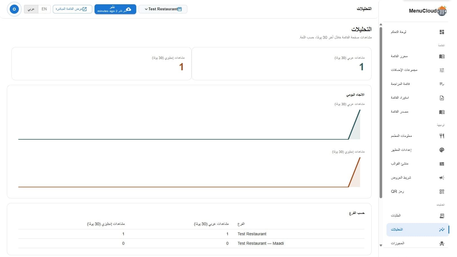
Open /admin/analytics and, if you're logged in as the account owner with more than one branch, there's a third block under the usual two stat tiles and the trend chart: a table titled "By branch." It lists Arabic views (30d) and English views (30d) for every branch tied to your account, side by side, instead of you opening each branch's dashboard separately to piece the picture together. With a single location, or logged in as a branch manager rather than the owner, that table simply isn't there. Everything else on the page works the same either way; the basics of what a "view" counts are covered in how to read your QR menu's scan analytics.
What's actually in the table
Each row is one branch: your original location plus every child branch you've set up under the model described in manage multiple restaurant branches from one account. The columns are the same two numbers from the top of the page, Arabic views and English views, counted the same way for every branch: a page load tagged to whichever language the guest had open. No combined column, no percentage, no ranking column, just the two raw 30-day totals per branch, so you can put "Koshary Maadi" next to "Koshary Zamalek" and see the actual gap between them.
One thing worth knowing before you read too much into a single row: the daily trend chart above the table, the two colored lines climbing and dipping, is your account's combined total across every branch, not a separate line per branch. The table gives you each branch's 30-day sum, not the shape of that branch's month day by day. If one branch had a single huge spike and another had a slow, steady month that added up to the same total, the table alone won't tell them apart.
The row order isn't a ranking
Rows list your root location first, then branches in the order you created them, not sorted by highest views. A branch sitting at the top of the table might just be the one you opened first, not the one doing best this month. If you're scanning for your strongest or weakest location, actually read the two numbers in each row. Don't assume position means performance.
When two similar branches show different numbers
This is where the table earns its place. Two branches with a similar setup, similar footfall, similar menu, should land in a similar range. When they don't, a few things are worth checking before writing it off as one location just being quieter:
- QR placement. A sticker on the table, a stand at the entrance, and a code buried inside a menu insert all get scanned at noticeably different rates. See printable QR table tents and stickers for what placement actually changes.
- Whether that branch has its own social media presence driving people to scan, or is only picking up walk-in scans with nothing pointing people to it beforehand.
- The branch's default menu language. If Arabic and English are unexpectedly lopsided at one branch and not at a similar sibling branch, check what language that branch's QR opens to by default before assuming it's about the guests.
A new branch will look quiet, and that's expected
A branch only starts counting from the day it goes live. Open a third location and check the table two weeks later, and it will show far fewer views than branches with a full 30-day history behind them, simply because it hasn't had 30 days yet. That's a clock problem, not a QR problem. Give a new branch a full month of its own before putting it next to branches that have been running for longer.
Owner-only, and what that means day to day
The table is scoped to the owner login on purpose. A branch manager still gets full visibility into their own branch's Arabic and English totals on the main dashboard, the same view a single-location account gets. What they don't get is the side-by-side comparison across locations that aren't theirs to manage. If you're the owner checking in on a small chain, this is the one page that puts every branch's numbers in front of you at once, without opening a separate tab for each address.